Go to:
Getting Started with Watercolours
(This information sheet is the one I usually hand out at the start of my getting started in watercolours workshops)
Many folk get deterred by the “language” of watercolour… “wet-in-wet” “graduated washes” “artists colours” or “student colours” “not or cold pressed papers” etc etc. There’s no mystery it’s all about painting.
Watercolour art is fun, immediate, and satisfying. You should not grow tense at the mere thought of playing with a box of paints, some brushes and a sheet of paper.
During the workshops Graham will introduce you to the materials and techniques of watercolour and provide you with the confidence to pursue the enjoyable and immersive hobby of watercolour painting talking you through and demonstrating exercises to improve your natural skills.
In the workshops to come Graham will demonstrate the skills of applying watercolour washes, mixing colours and other basic techniques to help you get started. Other associated skills and techniques such as, drawing, perspective and colour mixing can be briefly touched on and there will be time for you to raise your own questions about the unlocking of the “mystery of watercolour”. There will also be an opportunity for you to do some painting each day and perhaps even produce something you want to take home and frame!
The essence of the workshops will be to help you understand and enjoy watercolours — if you go on to develop your skills, refine an interest you enjoy and produce some pictures you are pleased with—that will be the added bonus of coming along to one or all of the workshops.
Unlocking the Mysteries of Watercolour. A Beginner’s Guide
Starting out in watercolours can be quite daunting without a little help with the myriad of apparent options, alternatives, equipment choices and essentials that face the raw beginner. Even for those who have picked up some information over the years, inherited equipment and made notes from T.V. shows such as “Watercolour Challenge” or “Sky Artist of the Year”. Where to start can be a daunting prospect.
Understanding and creating competent watercolour paintings becomes a little easier if you start off using the right tools.
As you develop and grow into the hobby, you will find favourite brands, styles and equipment, but discovering these and which ones work best for you is far easier if you know and have an appreciation of the options before you.
The workshops will hopefully help set you off in the right direction with your choices. We shall also have a play with some brushes, colours and techniques, and send you on your way with the desire to learn more about an all-consuming skill and hobby that you can enjoy in your leisure time, on holiday and as a vehicle for meeting new people in the many art and sketching clubs and societies that pepper your area.
Graham hopes he can imbue some confidence into your artistic veins.
Painting in any medium really is a journey! As you progress, you will gather information and skills and no matter where you find yourself on this creative path, it will always be useful to gain new insights.
Along any path however, there are always a few stumbling blocks and Graham will provide some tips about how to avoid these blocks and obstacles to your progression.
IT IS IMPORTANT NEVER TO COMPARE YOUR WORK WITH THAT OF OTHERS
The pictures you create are no better or worse than those of others – they are simply different. To carry on with the “Artistic Path” simile everyone is at a different point along the roadway.
There is something very personal about producing art, and it can feel at times like an extension of yourself. But by sharing your pictures, you can learn a little more about, and appreciate, your achievements. You will find that everyone you share your work with will be very positive about what you have done and may even be complimentary! Always be open to constructive criticism. The majority of the time, artists are their own worst enemies and it is easy to become discouraged. You will not become a gifted artist overnight, it takes perseverance and practice.
A good tip is to always put the date on the back of a work and in this way, you will see for yourself that you have moved forward. Keep your early work for reference and as a learning tool. Appreciate how your style and competence have developed, and remember, it is all a “learning process”.
So what is Watercolour?
Watercolours are paints made from finely ground pigments (colour) suspended in a binder of gum arabic, distilled water and a variety of additives to preserve and stabilise the paint.
It is the actual amount of pigment in the paint that makes the difference in the quality of the watercolour and is the difference between say, students’ quality, and artists’ quality paints.
Watercolours come in two main forms, In tubes, where the colour has the consistency of say, toothpaste and in “pans”, where the colour is like a tiny cake of colour. Basically, it’s the same stuff, except the tube paint has more water in it and therefore requires less water from the artist to get it working.
Once water has been added this releases the pigment and as you use your brush to apply the paint to paper you are basically dropping the waterborne pigment onto the paper . As the water evaporates it leaves the pigment on the paper where it becomes your painting…… how and in what way you choose to apply the paint is down to you…. The artist!
↓ Download Getting Started with Watercolours (.pdf)
Watercolour basics
Suggestions for a Basic Kit to get you Started.
The Paint Box.
Watercolours come in little tablets called “pans” and “half-pans”and also in tubes. I would suggest a box of 12 or 16 half-pans to start with. As you progress you will find that you favour some colours more than others as you begin to develop your own style. Naturally as you use the favourite colours more often, the pans will need replacing – better still you can then buy tubes of these colours and squeeze the colour into the empty pan. This topping up works well and means you only buy colours as you need them. Some online stores will sell empty boxes (they’re not cheap!) this means you can buy a box and choose your own colours. Alternatively buy a ready made up box and replace some of the colours you don’t like or will never use. I always wonder why the manufacturers always include a white which any self-respecting watercolour artist would never use and a black which again is very rarely used by watercolour painters
I would suggest buying the better quality paints these are called “artists’ quality” they mix better, have stronger pigments and are more light-fast. The alternative are known as “student colours” (or sometimes “Cotman colours”) it is false economy to begin with these and harder to learn the techniques of say, laying -in a wash or mixing wet-into-wet.
The Colours.
There is no right and wrong about which colours to use, but like the best parties good mixers are essential! After considerable soul-searching, research, and changes of mind over the years, I settled on the following selection of “warm” and “cool” colours;
My favoured warm colours are: Cobalt Blue, French Ultramarine*,Sap Green*, Burnt Sienna, Yellow Ochre*, Cadmium Yellow, Cadmium Red and Permanent Magenta.
My favoured cool colours are: Indian Red*, Alizarin Crimson*, Aureolin, Burnt Umber*, Sepia, Cerulean Blue, Indigo.
The ones with an * are the six starter colours I should choose if pressed!
Every Artist favours different colours and I have yet to find two art books where the artists have chosen exactly the same starter colours. At the end of the day it is trial and error, experience, and personal choice – but you wouldn’t go far wrong with the above selection!
Brushes
Brushes come in many sizes and makes and you can spend a fortune on them! Again the better the brush the better the service you will get from it, and the better the variety of line you will produce. Brushes are the most important tools in your box so buy a reasonable quality and always look after them by cleaning them when you have finished and storing them so the bristles don’t get bent.
Sable brushes are the best for watercolour, sizes range from 00 to 12 in most ranges and you will be able to tackle most pictures with a size 10 round, 8 round, & 5 round. Be careful you don’t go for small brushes too early as these are really for detail only, the bigger the brush the more colour it will hold and the easier it will be to produce good and even washes. Proline brushes are the next level down but don’t hold anything like the same amount of water/pigment.
Other Equipment
H.B. and 2B pencils. use a knife ideally to sharpen your pencils as you can achieve a better quality of shape for the drawing edge. A pencil sharpener is the obvious (but not as satisfactory) alternative.
A putty rubber (this is a special eraser for watercolour paper as it doesn’t affect the surface of the paper ).
Masking tape. for fixing your paper to the board and creating sharp edges to your work if you wish.
A mixing palette buy a ceramic palette as the plastic ones do not help colours to mix evenly or pool as well. One with 5 to 6 colour holders is fine.
If you are working at home a plywood board about 50cm x 75cm is ideal propped up on a couple of books. Easels are very rarely used in watercolour painting as you want your colours to run at a gradual pace and not vertically down the moment you apply them!
If you are working outside just use your sketchbook on your lap at first.
A Sketchbook A5 Size, nothing too ambitious at first! Not Cartridge paper though it is too thin. Sketchbooks come in many sizes and shapes, but choose one which calls itself a watercolour sketchbook as the paper in it will be a heavier weight and therefore take watercolour without cockling (cockling is a term for when a piece of paper absorbs water and starts to bubble up and buckle losing its flat shape).
Paper
Clearly you will need more paper than just a sketchbook for when you start to work on larger pictures… however such is the variety and detail of information needed concerning the selection of paper I am not addressing it here other than to say pick the size you want and choose a Cold Pressed (sometimes called “NOT” paper at least 300gsm/140lb in weight. this is an ideal paper to start with.
…And a bag to carry it all in….and you are ready to go and make a name for yourself in the world of watercolour painting.
Just a last thought….
Do not buy one of the boxed watercolour painters’ kits, invariably they contain inferior materials that manufacturers just want to offload onto an unsuspecting public!


↓ Download Watercolour Basics (.pdf)
Brushes for Watercolour painting
A few thoughts on the types and choices
The best brushes for watercolour painting are generally agreed to be Kolinsky Sable….and are unsurprisingly the most expensive (be prepared to take out a bank loan for the larger sizes). The reason they are so expensive is that they hold a great deal of colour whilst giving you perfect control of the transition of that colour onto the paper. If you treat yourself to one look after it (or better still contact Securicor).
Alternative brushes are made from Red Sable, Squirrel hair, and other hair mixes, they are cheaper and whilst you lose a little of the control they are every bit as good for general watercolour painting. There are also some good synthetic alternatives “Dalon” and “Proloene” which will also give you good service for a while but tend to thicken up quickly and become unworkable far quicker than quality brushes.
Try using a synthetic brush and a sable of the same size, you will quickly see the difference,
the sable holds more liquid.
Why is this important I hear you ask…. Well I’m glad you asked that… if a brush holds more water/colour it means the delivery of the colour will be more consistent, the colour will look the same on the paper. If you are doing a large wash this will help in achieving the consistency you desire without having to go back to your reservoir of colour as regularly as you would with a cheaper brush.
If you look after your brushes, sable and squirrel mixes will give you better long term service than synthetics. (They should always be washed/rinsed in clean water and stood vertically after use, occasionally a clean with a little touch of washing-up liquid will help but not too often.)
The basic types of brush: A Round , a Flat, A Mop, and a Rigger are seen here in that order.

The flat is used mainly for applying washes , large areas of consistent colour or specialist detail for instance bricks in a wall.The round is for everyday use a general purpose brush which will produce a thin line or a wider line dependant on how much pressure you exert on it. Round brushes are graded in general use in sizes from 00 (very small) to size 12. Use the largest brush you are comfortable with, a general mistake of the amateur artist is to use too small brushes, the work becomes streaked,inconsistant and fiddly.Unless you intend producing miniatures or high quality botanical work your smallest brush should be a 3, use an 8 or 10 for most of the picture and a 6 or 7 for some detail work.
The mop is a cheaper alternative to large rounds and will deliver large amounts of colour onto the paper favoured by those who use wet on wet techniques (the merging of coloured washes on the paper rather than mixing off the paper and then applying the mixed colour)
The rigger is a long thin brush and is used for delivering thin lines onto the paper for instance twigs of a tree, telegraph wires and ships’ rigging ( which incidentally is where it got its name from, maritime artists first used it for precisely that purpose)
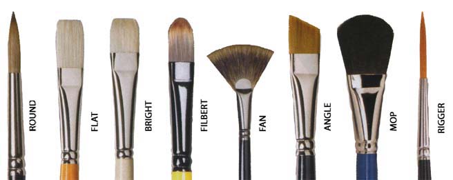
These are not the only brushes available and you can try out others as you progress with your journey into the world of watercolour. Basically other brushes are just aids for specific applications for instance a Fan brush will produce foliage in a specific way or bushes in a distant landscape. Other brushes are a luxury and not necessary for day-to-day watercolour painting but can be fun on the odd occasion.
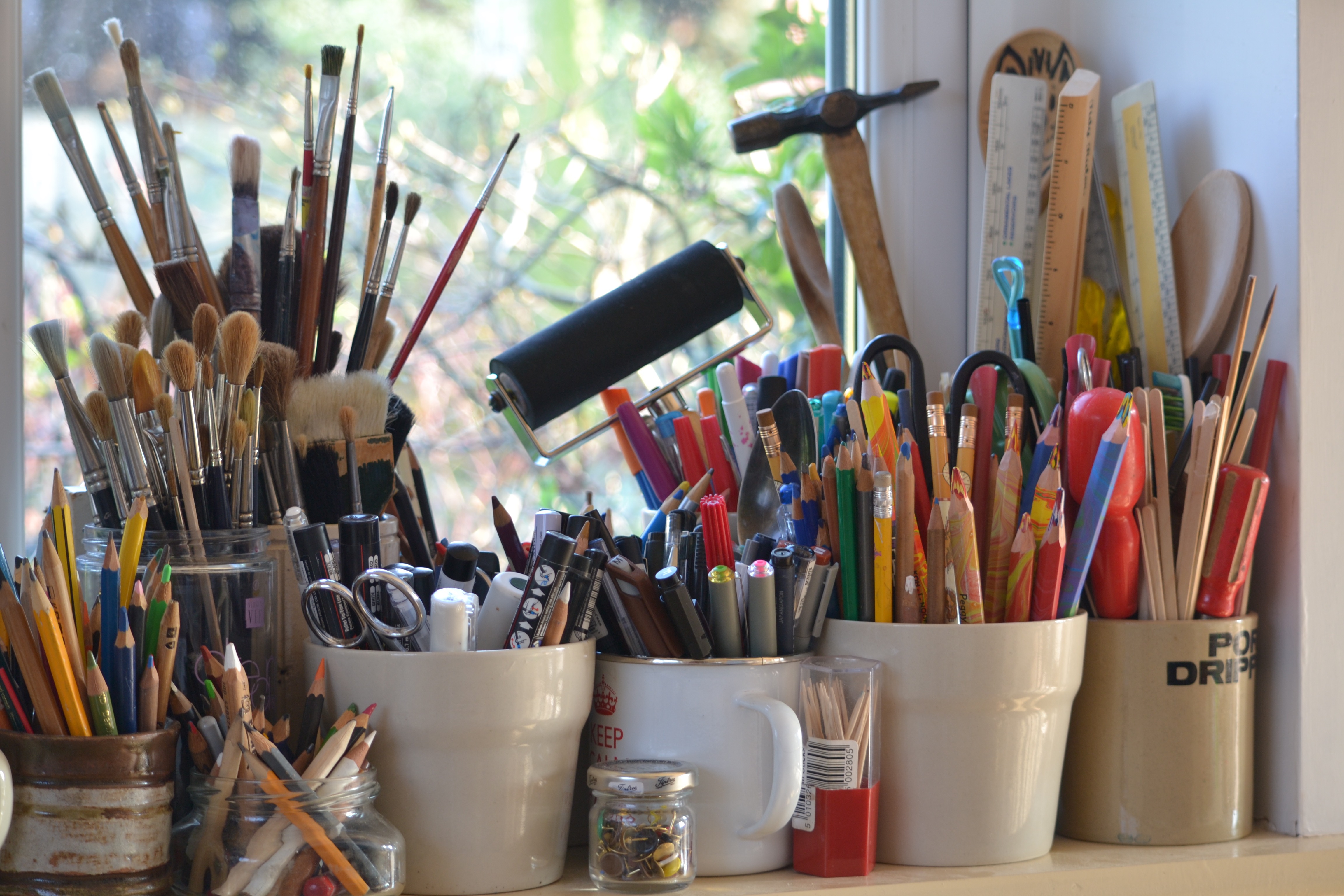
Some artists can never have too many brushes or other equipment… above: my window sill!
↓ Download Brushes for Watercolour Painting (.pdf)
Paper for Watercolour painting
A Few Thoughts on the types and choices
You can use any paper for painting, but, it’s far better to use a paper especially made for watercolour painting……because:
- They have unique surface textures which respond to a brush.
- They have absorbency characteristics which hold paint and respond well to the water content.
There are many types, makers, weights,sizes but they all have TWO things in common:
They are all finished with one of three types of surface texture,
- Rough, Not (sometimes called cold-pressed) , and Hot Pressed.
- They are all graded by weight.
Surfaces.
Rough: Has a pronounced texture, a coarse surface (known as “tooth”). it is ideal for strong broadly painted washes, textured lines and dry brush work. It is NOT suitable for detailed work, pen and ink or soft pencil.
Not (cold pressed): Has less tooth, a semi-rough surface for medium grain which accepts washes without too much absorption. It is the paper most commonly used by amateurs and professionals alike.
Hot Pressed: Is very smooth (but don’t confuse it with cartridge paper) It has very little tooth and is ideal for very detailed work, pencil and wash, botanical work and fine brush work.
Paint runs very quickly on this paper so you have to know what you are doing!
Weight.
Until relatively recently the weight of a paper came from how much a ream (480sheets) of it weighed (useful trivia fact!). But now it’s the weight of a square metre of a single sheet of paper given in grammes (gsm) So that’s just confusing isn’t it!
What you need to know is that the heaviest paper in common use is 330lb (or 638gsm).
The average for watercolour pads in use is 140lb (or 300gsm).
The advantage of heavier weighted paper is that you probably don’t need to stretch them which avoids hassle if you like your watercolour wet!
You can use the paper straight out of the pack or pad and it won’t cockle as much as a thin paper. If you are doing something really special it’s probably best to stretch it anyway.
So what’s this stretching I hear you say….
Stretching:
Paper cockles as it gets wet and the thinner the paper the greater the buckling caused by the absorption of the water you apply. The pigment in the paint pools on the paper and it all gets really horrible. Stretching avoids this.
METHOD: Take your piece of paper, find a wooden board (ply is best) larger than your paper, some brown gummed paper (not parcel tape, not masking tape not sellotape) and fill a large sink or bath with water (cold).
Soak your paper in the bath/sink until it goes a bit transparent at the edges (about 5 minutes) and take it out holding it up to let the excess surface water drain away.
Lay it on your wooden board Whilst the paper was soaking you had cut 4 lengths of the brown gummed paper into 4 lengths greater than the sides of the paper.
Now lay the paper flat on the board , damp it down with an old towel and fix each edge of it to the board with the damped gummed paper. The gummed paper should be for the whole of each edge and a bit longer, and half on the paper and half on the board. If you try to economise and do say only a third of the gummed strip on the paper and two thirds on the board, the paper will pull away from the strip and make all your efforts pointless!
Leave the board on its edge to dry naturally overnight. Next day the paper will be as flat as a pancake and an absolute dream to paint on. The bonus being It will not cockle when you apply your washed colour.
Back to the Paper:
Papers can be bought loose, in pads or in blocks.
Blocks come in various sizes and are fixed on all four sides which means they do not cockle and are easy to use if you are on your travels and painting ”en plain air” which is painter-speak for outdoors. You do however pay a premium for this.
Loose paper is best used in the studio and will work out cheaper than the equivalent paper made up into pads or blocks.
Finest quality and hand-made papers are usually loose but are the Rolls Royce of papers and it is best to know what you are doing with them before you make the investment.
Experiment with papers, coloured paper, heavyweights, cotton rich, handmade….etc etc.
As with paints you will settle eventually on a paper that suits you and your style, and as with paints and brushes the better you know the inherent qualities the more fun you will have in pursuing your hobby and will begin to produce the results you are happy with.


↓ Download Paper for Watercolour Painting (.pdf)
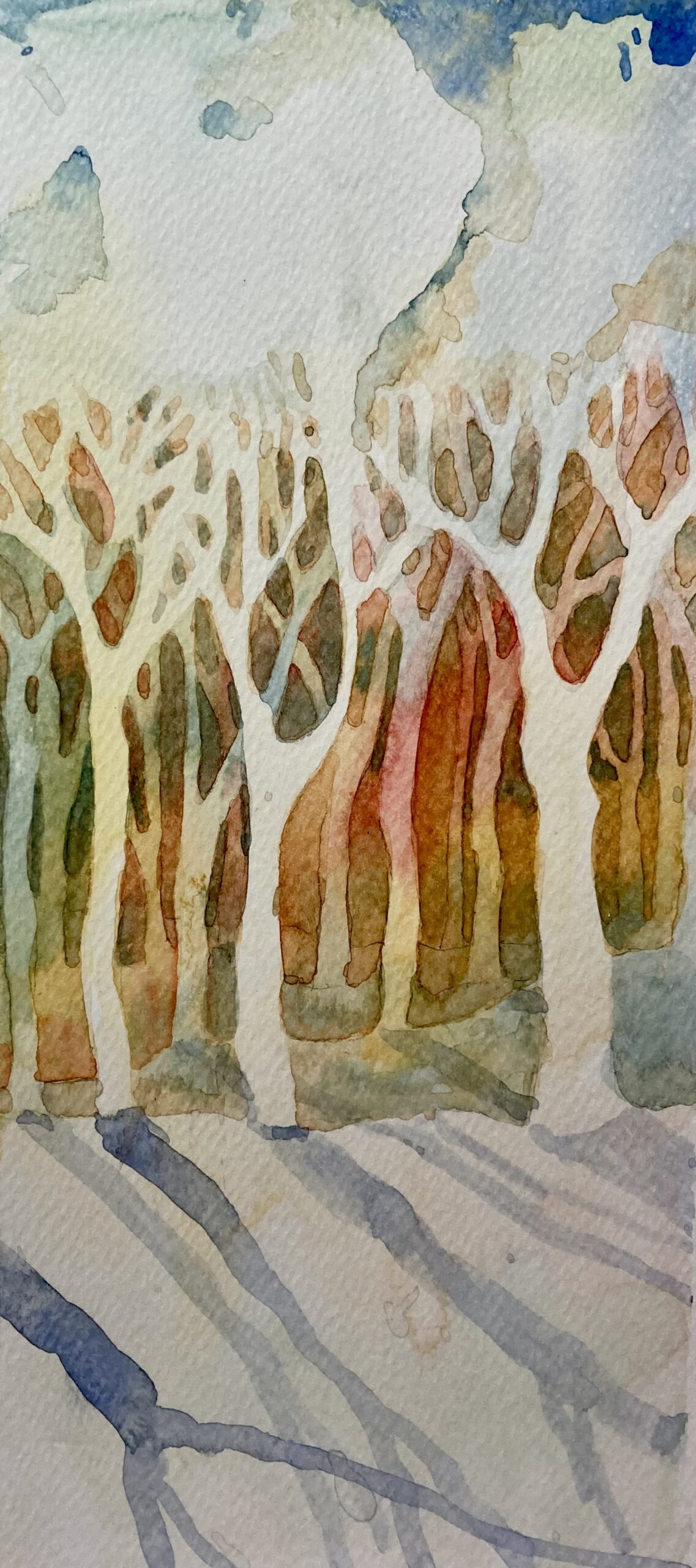
Sunsets in Watercolour
A Few Thoughts about Painting Sunsets in Watercolour


Sunsets, especially ones where the view is across water, are one of the favourite subjects for watercolour artists. On the face of it this traditional subject should be, well, straightforward.
It is not! In fact many sneaky hazards lie in wait for the unsuspecting artist.
Here are a few thoughts to help navigate the potential pitfalls as you approach rendering your sunset.
- You will be using considerable amounts of water for your picture. A successful sunset is the product of mixing colours on the paper and enjoying the “happy accidents” arising from the free-flowing pigments. It therefore follows that your choice of paper is key to a successful picture. Therefore use either stretched paper or a paper that is at least 350gm in order to avoid horrible cockling of your paper. Use either Not (cold-pressed) or rough paper.
- Work with a limited palette of colours. There is no need to raid your whole paint box for a happy outcome and by using a limited choice your work will achieve an enhanced harmony.
- Do not use black. Blacks have their place in watercolour but this topic isn’t it. Blacks dull a work. Blacks give no reflection. Blacks are not transparent and provide “body colour” a deadening out of keeping with our subject. Use warm primary colours.
- Mixing your dark colours from the colours in your choice of palette is the order of the day. If you are not sure of the mixes have an experiment on another pice of paper before you start the main picture.
- Avoid any colours with a green hue within them, for example lemon yellow. An acidic tinge to the work will make it hard to achieve a warmth to the work. Cadmium hues are ideal. And as you work your painting avoid overlapping colours that make green in your sky. (Not too bad if it’s in the sea) If you see that you have accidentally made a greenish hue in your mixing of the colours on the paper, adding some pink or carmine to neutralise it.
- Apply your warm colours in a wash first. And work in layers. As alluded to above, the beauty of watercolour is the layering of transparent washes. With each new layer/wash a little of the previous layer remains and shows through. Enjoying this is one of the thrills that watercolour can bring!
- Be bold with your dark colours . After all there is no light without dark!
- If you are adding people or boats to generate a little more interest in your work. Sketch them out first on another piece of paper. Plan where they will go. This will give you confidence when the time comes to add them to your picture.
- Have a foreground in your work. This will create depth to the picture and provide the opportunity to frame the view. Make sure your foreground is dark enough.
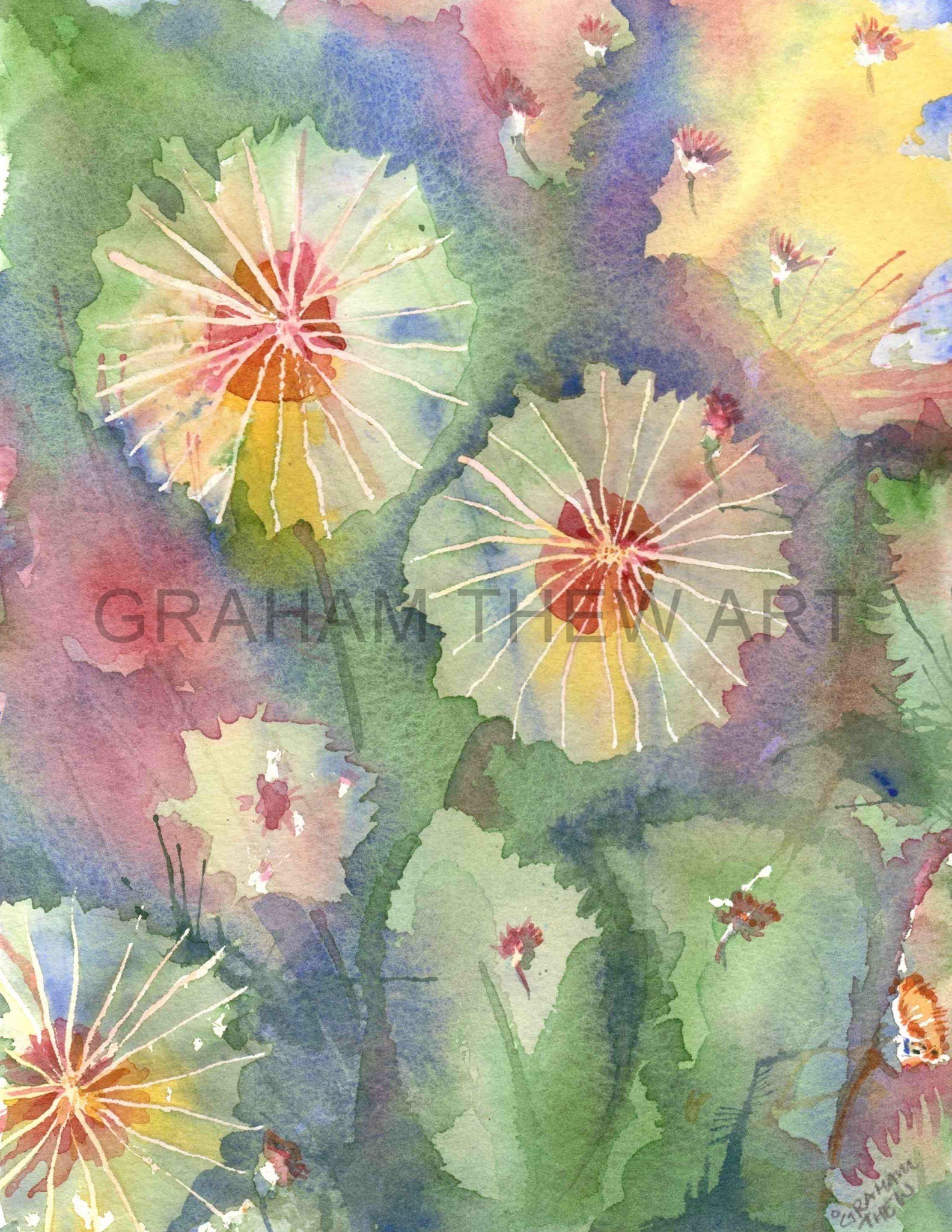
- be happy just to play with colour and see where it takes you. The picture above took 5 minutes and whilst the colours “bloomed” into one another it is not a wholly unpleasant outcome, but certainly I learnt from the time spent and process, and gained confidence for future attempts at A Sunset in Watercolour

↓ Download Sunsets in Watercolour (.pdf)
Sketching
A Few Thoughts on Sketching and Inspiration
You wouldn’t expect an athlete or a footballer to give of their best without exercising and preparing for their game or run, well it’s the same with art — you cannot expect to develop as an artist without “warming up”. Sketching is the way to do it!
Sketching makes you look at the world around you whilst refining your skills with pencil,or the brush, or the pen, in fact with whatever you decide to use to sketch.
One of the hardest things about art as a hobby is finding that next subject, getting the enthusiasm to depict something that has taken your interest, or waiting for inspiration to strike.That moment of inspiration can strike at almost any time but I find sitting sketching and the quiet moments of thought that go with it often trigger inspiration .
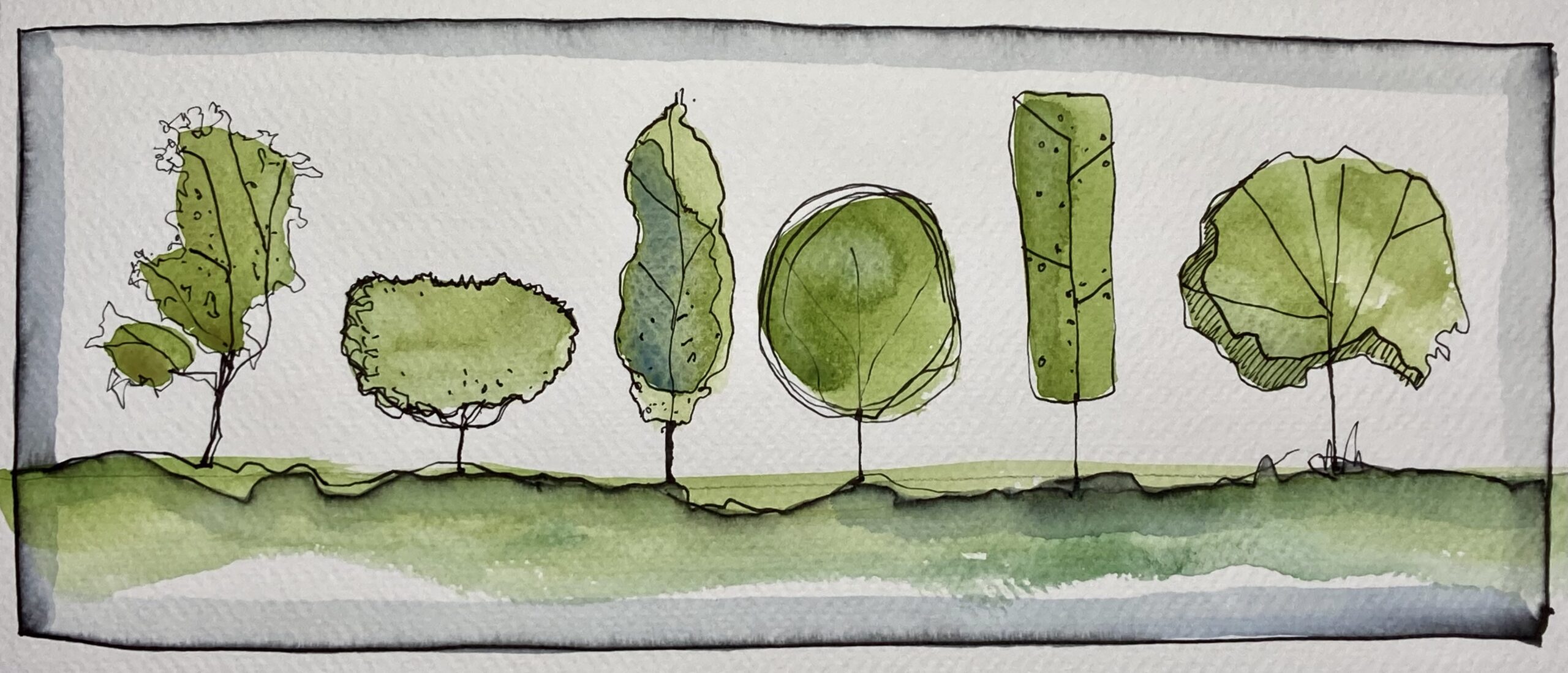
A passing boat, an old gnarled tree, an industrial horizon, the simple observation of a passing event, all offer possibilities, a chance to sketch and maybe take the drawing further as a full blown painting.
Regard everything as potential subject matter and you will never be short of inspiration and ideas for paintings.
It’s not always about the subject matter itself…sometimes it might be the light, the interesting shadow cast by a building , colours, reflections in fact anything that motivates you and makes you want to record what you see.
And it’s not just when you are on holiday in some balmy tropical hideaway, the urban environment seethes with potential subjects just waiting for you to spot them.
If you haven’t sketched or painted outside before, you may need to pluck up courage to begin, but do not let a fear of what others may think prevent you from enjoying the bounty of the subjects the “great outdoors” presents! In fact never worry about what other people think, enjoy the relaxation and sense of achievement that comes from such an engrossing pastime.
To get started all you need is a small pad (A5 size is ideal) and pencil and ensure you always have them with you when you are out and about. You can sketch in the airport, waiting for a train, in the park watching the dog run round… in fact sketch the dog! There is ALWAYS something to draw – a tree, your shoe, your garden gate, cars, clouds……
With every sketch you learn a little more about; how to look, how to record, how to refine your drawing technique.
It will become a visual diary, (always pop a date on the drawing) you will be able to look back and see how you have progressed…and you will!
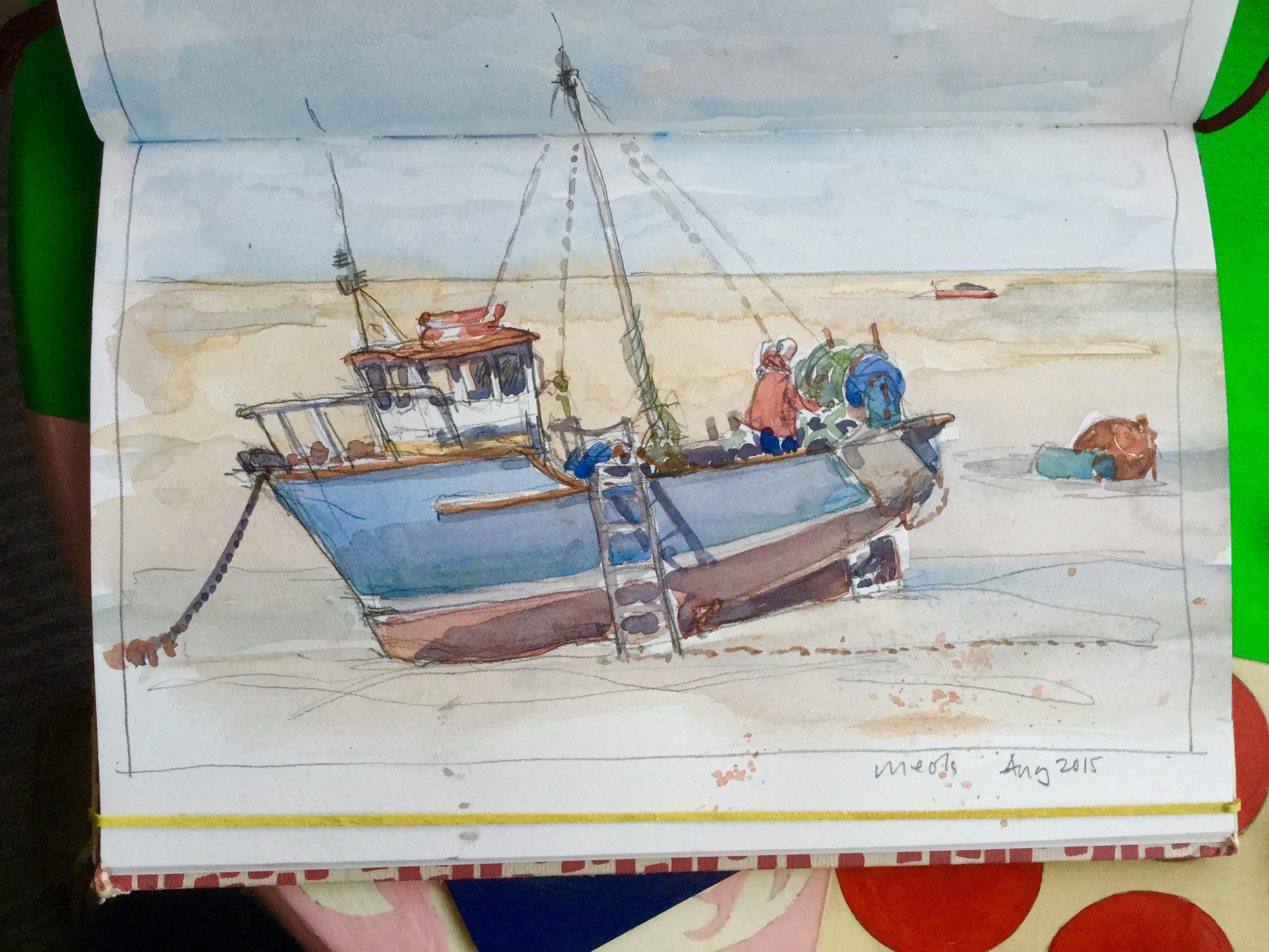


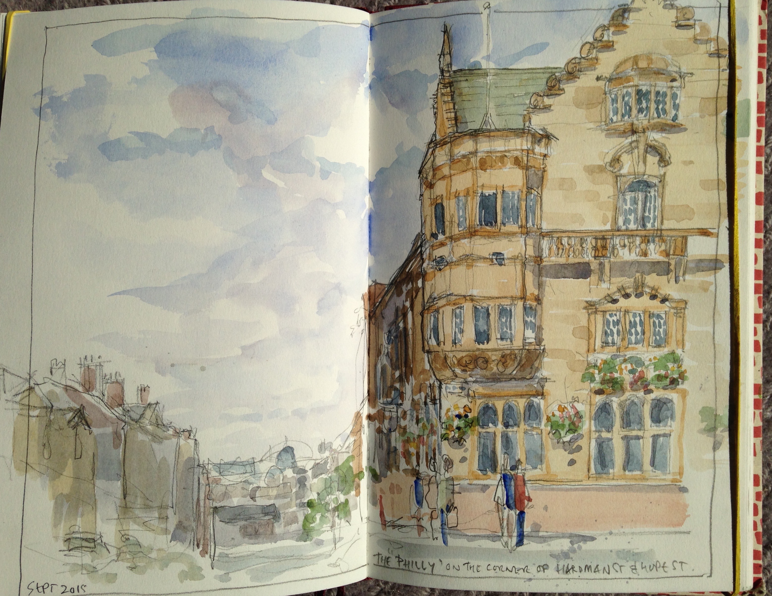
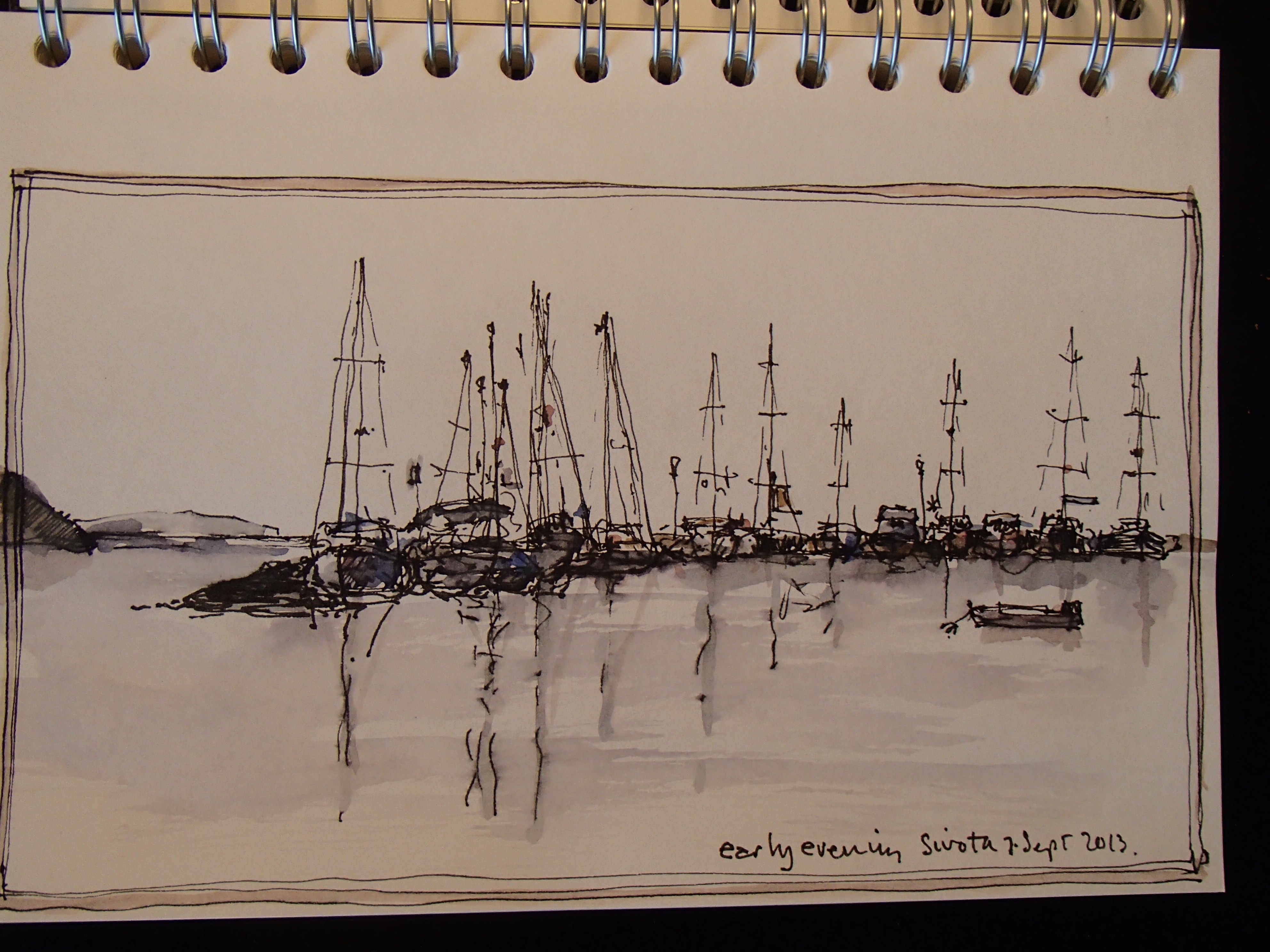
Examples from my sketchbooks
↓ Download Sketching: Some Thoughts (.pdf)
Sketching: Some Dos….and Don’ts
Don’t be too ambitious with what you are about to sketch.
Don’t think that every time you put pen to paper you will produce a masterpiece, because you won’t. Remember sketches are for practice, for memories, for enjoyment.
Don’t worry about what others may think of your drawing.
Don’t just use a pencil, try out other things, for example pens, brushed lines, felt tips.
Don’t draw something you are not interested in.
Don’t compare your work to others when you are working in a group. Other people’s sketches are not better or worse than your own – they’re different! – and it doesn’t matter anyway you are doing this to enjoy yourself!
Don’t sit in full sunlight, on an uncomfortable rock, or in a draughty spot, (that’s just daft!)
Do Let others see your work if they ask. Passing strangers will ALWAYS be complimentary about your work, fellow sketchers will ALWAYS be encouraging.
Do make lots of sketches of the same thing if it interests you. The more sketches of a subject you make the more you will learn about it and the clearer the forms will become.
Do make yourself comfortable, you are doing this for pleasure.
Do leave things out if they are boring, really tricky to draw, or you just don’t like them in your picture. It’s called “having an artistic licence” and its well worth the money you paid for it.
Do sketch people, pictures look so much more convincing with people in them (J.M.W.Turner drew rubbish people but that didn’t stop him from putting them into his pictures)
Do spend that little bit more money on a nice sketch pad or some nice paints, this is after all your hobby and you’re worth it!
Finally answer the question, “Why do I think this is a good view to sketch….?”
Almost any answer is correct unless it is….
“Because others are sitting here” or “Because I need to fill a page in my sketchbook”


↓ Download Sketching: Some Dos and Don’ts (.pdf)
Urban Sketching
A workshop with Graham Thew
What is “Urban Sketching” anyway?
Urban sketching is quite simply the act of drawing on location, indoors or out and capturing what you see from direct observation.
It has become something of a global phenomenon. Beginning in the early years of the century there is now a global community of artists drawing on location, and capturing the life that flows around them, wherever they happen to be. There’s nothing new about the idea, people have been sketching and painting in groups for centuries, but somehow it is improved as a shared activity in this troubled world where “community” is often a thing of the past. As such it has struck a chord with many amateur and professional artists.
The result is that the activity has grown into a massively popular movement, connecting sketchers from all over the globe, who share their work, support and inspire one another, and inspire other sketchers everywhere. Drawings are often shared on the Internet which has certainly contributed to the rapid expansion of the “Urban Sketching Movement”
After all, we all see the world differently, our own outlook on life mitigated by the thoughts and views of those around us. We all have different horizons and whilst recording this perspective on life can be done in many varied forms, sketching is probably the most basic and yet potentially the most meaningful of these forms.
But whether or not you choose to share your work Internationally, nationally, locally, or not at all, the main reason for taking part is that it is a fun community activity . No membership requirements or standards, no role calls, no subscriptions. Just groups of friends meeting up for a shared activity , a chat, and an interest in common.
Most groups meet for 2-3 hours, sketching together (but not usually shoulder to shoulder) in an area of interest. They then reassemble at a pre-determined location (usually a pleasant hostelry or cafe ) to share their experiences, have a look at one another’s sketches, and smile.
You can get as involved as you like, there are International Expos’ attracting thousands of sketchers, national forums, sketch weekends and regular monthly meetings. Locally, Liverpool and Wirral Urban sketchers are active and welcoming groups attracting 40-50 sketchers at their monthly meetings come rain or shine.
Everybody can draw!
It’s just that many people have long since stopped and developed the “I can’t draw for toffee” and the “last time I painted was at school” excuse. This phobia (for that’s what it often is!) is the result of the way our society educates people to believe there is a “right” and a “wrong” way to draw. There isn’t, there’s just many different ways of drawing and therefore many ways of seeing and interpreting one’s environment.
“Every child is an Artist. The problem is how to remain an Artist once we grow up”
Pablo Picasso.
Basic tuition helps to build up confidence, awareness, and an understanding that sketching & drawing are essential elements of the activity known as “Art”. Urban Sketching is not competitive, not comparative, and not judged.
“What’s the difference between Drawing and Sketching?” I hear you say…
the quick answer is “not a lot.” But thinking about it in the context of Urban Sketching I should say….
Drawing is draughtsmanship, being able to draw exactly what you intend as the motive for your action. Perhaps using the product of your work to inform others in detail about what you have seen, what you intend others to fabricate or to make an historical record .
Sketching is what you do when you are searching to capture a moment or a feeling, a quicker and more interpretive activity. Sketching is about observation, thought and choice.
“Why Sketch and not photograph ?” Is your follow up question………Because,
You see more than a camera.
You can see into the shadows.
You can appreciate form and depth.
You have two eyes not one lens.
You can “see through things” i.e. wait for a van to move, a tree to blow, a person to walk.
↓ Download: What is Urban Sketching (.pdf)
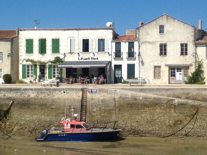
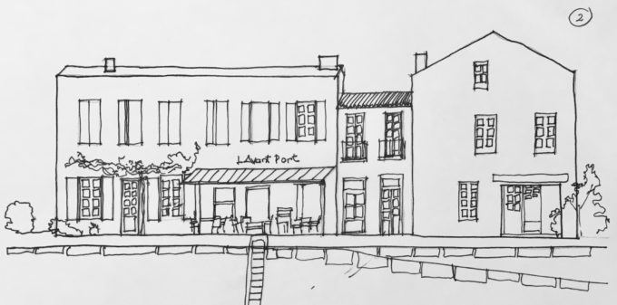
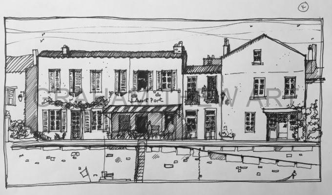
Buildings… A Brief Guide to Sketching Them
Artists and authors have written many detailed and interesting books manuals and articles about the myriad of ways there are to draw and sketch buildings. In the brief programme of a workshop it seems to me that the best way to approach the topic of buildings is to present a way of looking at them that will take away the fear of perspective, hard lines, minuscule detail , shapes, ornament architectural styles etc etc.
Many a good urban sketch is all about the things that happen in our townscape environment and buildings inevitably are the backdrop to that story.
Therein lies the key to sketching them. Look at them as a stage set , a backdrop that can have as much or as little detail drawn on them as you wish. Use your X-ray eyes to see through the ephemera that is street signs, aerials, street furniture, people cars, and the rest of the urban paraphernalia.
The Art of drawing buildings lies in simplifying the subject
See the mass of the buildings first, look at them for what they are , giant lego-like blocks. Huge three dimensional shapes that sit on the edge of our roads and streets.
(Just before you start…. note the time)
Now set to with your sketch….
Using a fine line most probably a pencil (H.B. or 2B) Draw that block first, the simple long lines that make the front and sides (that’s if you can see the sides). Then if you can see the roof on top of the block you have created sketch that in too. don’t worry about if you are going “through” things at this time that’s why you are using a fine line, these are the guide lines for your drawing.Once you have drawn a building or a number of them,
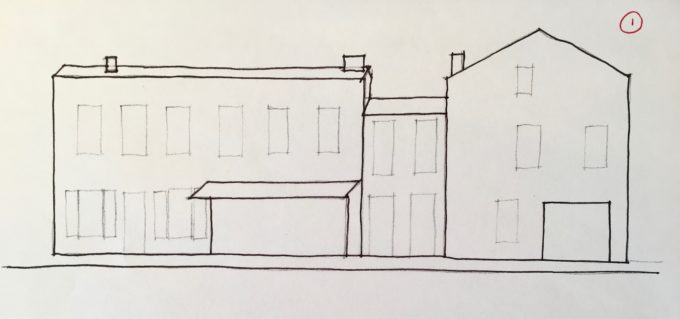
STOP. Take a moment to review what you have set to paper. Ask yourself some questions…….. for example:
Are the vertical lines vertical?
Are the buildings the right size in proportion to one another?
Do you like the composition of your sketch so far?
Have I bitten off more than I can chew at this time?
If you don’t like what you’ve done …start again, or move on to another place to sketch….. Remember you are doing this to enjoy yourself. But also remember……. in drawing the phrase “practice makes perfect”could never have been more appropriate! The good thing about your sketch being in your book is that you cannot throw it away (which might have been your first inclination). Put a date on the drawing and write a couple of notes about why you moved on without finishing it. I promise you here and now, if you draw the same view again straight away or in the future, the sketch will improve, and that’s because you will have learnt something from the process. (And I didn’t say learnt from your mistakes!)
Okay, let’s assume that it’s worth pressing on. Look again, what are the next most important elements of the view in front of you? Is it the windows? the shopfronts? the tree blocking some of your view? Whatever they are sketch those in too, but with the constant awareness that each line you apply needs to relate to what you have already drawn in the right way.
In this way build up the framework of your picture.
When you are happy that the framework is complete, STOP. Take a moment to review what you have set to paper. Ask yourself some questions……for example:
Am I happy with what I have done so far?
Is there anything essential to the sketch that I have missed?
Have I fudged an area which will be important to the finished sketch?
Once you have taken that moment, stand up, have a bit of a walk around, if you are with others have a look at what they are doing, breathe.
Now return to your position, have a look at your sketch and review it again. I find just a moment away can often highlight if there’s something not quite right and provide the opportunity to tweak it before moving on to the detail stages.
Start to harden up some lines, if you think the sketch would look good as a pen and ink work, break out the pens, if you feel colour is the important element , break out the watercolours

Your sketch has now taken a life of it’s own and will pull you along as you add detail, colour, and things that you simply didn’t see when you first sat down.
Add as much or as little detail to your scene as you want to, it’s your sketch, it’s your time, it’s your hobby.
When you are comfortable that you have done as much as you want to at this time,
stop. Believe me there’s an art to doing this as well, knowing when a sketch is done, when it shouldn’t be tweaked any further, when the detail you need is there, and when the balance is right.
There’s a couple of final things to do..
Put a date on your drawing and note how long it took (that’s why I said note the time before you started)
Take some photographs of the scene. You may like to draw it again at home and your experiences on site along with the aide memoir of the photos will set you in good stead for approaching the view again.
Breathe, and move on to your next Urban Sketch…..
↓ Download: Buildings a Brief Guide to Sketching Them (.pdf)
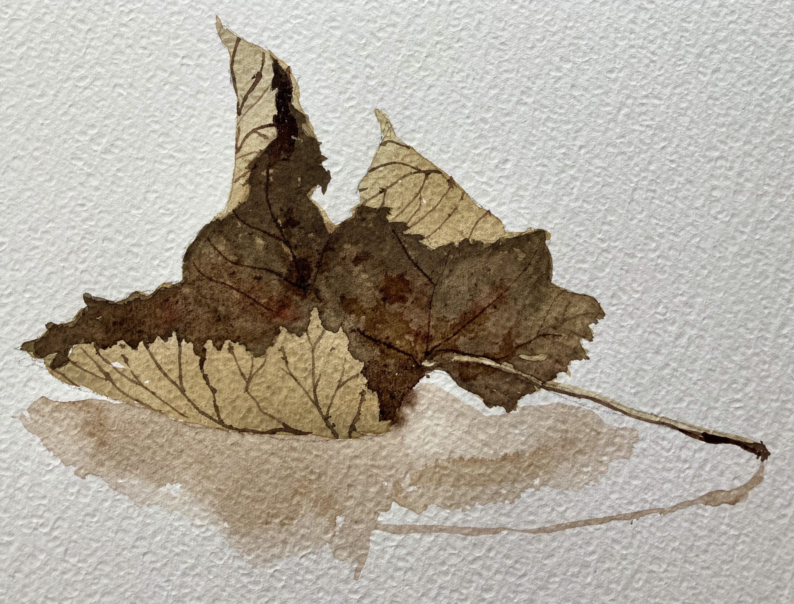
Tone in Watercolour
Simply put the word TONE in art refers to how light or dark something is. How black or white and all the grey tones in between…… Or how light or dark a colour, appears.
“Tone”is often thought of as one of the key characteristics of good painting. You may also hear artists talking about “Tonal Value” or just “Value” These terms both mean the same thing as
TONE
In “real” life Tone is created by the way light falls upon an object, or a scene, or in fact any subject matter.
HIGHLIGHTS are the part of the subject on which light is the strongest.
SHADOW is the the part of the subject on which light has the least impact.
TONES are important for the range of effects we desire to achieve when rendering a subject in watercolour, or in fact any type of artistic medium.
To create a particular atmosphere / To create contrast / To focus attention on particular areas / To create the illusion of form, distance or depth.
THE CONTRAST IN TONES CREATES THE VISUAL EFFECTS WE SEEK AS ARTISTS,
Balances, Moods, Atmospheres. In short the understanding and use of tones goes to the very core of our work.
Working on a VALUE scale can help enhance our perception, and act as a resource for, our judgement of Tonal values.
It is also a useful exercise in applying watercolour washes and demonstrating the transparency of watercolour pigments.
Here is an example of two painted scales, one of white to black and the other of layers of French Ultramarine.

Such a scale demonstrates the effectiveness of layering “glazes”
(A “glaze” in watercolour is simply a name for a layer of paint)
The layers present 9 values.
A Value refers to how light or dark a tone is.
Dark tones are said to have LOW VALUE
Light tones are said to have HIGH VALUE
Each of the nine levels of the value scale has it’s own name:
White.
High light.
Light.
Low light.
Mid value.
High dark.
Dark.
Low dark.
Black.
So to recap…..Value and Tone are the fundamentals of a good watercolour painting
Do NOT get confused into combining the relative lightness or darkness of a colour with the quality we call “HUE”
“HUE” is the appearance of the colour i.e blue, green, red.
Blue and Red can have the same tonal value even though their hue is different
Judging the tone and value of a subject you are about to render is one of the first steps you must make in assessing it’s qualities.
If your assessment of tones is correct relative to one another, you can be more confident you will produce a work with a believable sense of space, form, and light.
In fact, it can be argued that Tone and Value are more important than colour to the success of a watercolour. We understand our world not by colour, but more by perceiving objects and their shape, by seeing how light or dark they are and their interaction with one another.
In watercolour tonal values are the essential building blocks of the successful rendering of any landscape, seascape, or object study.
Adding darkness to a watercolour is easy BUT you cannot add lightness !!
You must make evaluations of tone at the start of the process. In watercolour particularly because the white of the paper is reserved for the lightest tones (the high values). Often known as “highlights”. We work from light to dark adding glazes/layers and building up our work to the point that the dark tones are applied.
Contrast.
Is the difference between tones in a picture.
A small amount of contrast between the lightest and darkest areas of a picture will result in an image that is perhaps less distinct but one with more atmosphere, subtlety and calmness.
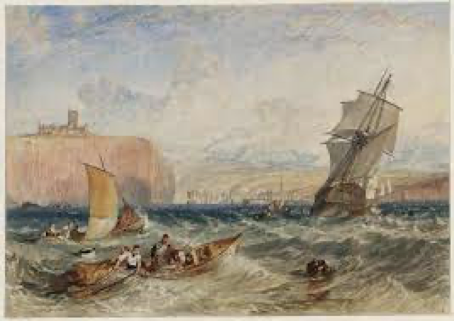
Turner was of course famous for his atmospheric works where relied a great deal on the use of subtle tones and graded washes.
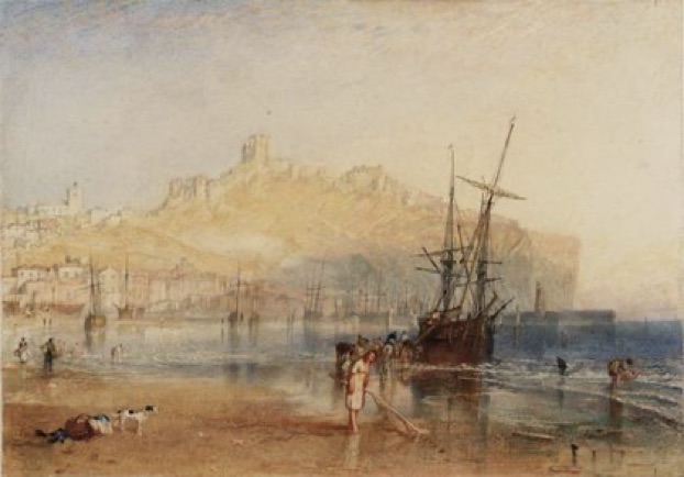
If there is a great contrast in the tones of a work there is likely to be a more dramatic quality about it. Henry Fuseli was famous for his works which used great contrasts between the lightest and darkest areas of the painting.
Chiaroscuro is a phrase used to describe such works where there is a high and dramatic contrast between the shadows and lights. The words itself coming from two Italian words: chiaro meaning light and scuro meaning dark.

Whilst not a watercolour, the painting fondly known as “Whistler’s Mother” is a great example of the use of tones to achieve a dramatic image and it is very pertinent to consider the real title of the picture in this context which is “Arrangement in grey and black.”
Putting this into practice
In “traditional” watercolour paintings painters start by laying down the lightest washes first leaving the white of the paper untouched. They then lay in successively darker washes over the top to create the detail.
One of the best ways to practice this skill is to paint a tonal picture using one colour only. Ideally use a dark colour such as Sepia, Paynes Grey, Indigo or Cobalt Blue. These colours are easy to glaze over and provide a good range of tones to work with.
You will need to choose a black and white photograph for this exercise.
Newspapers are an excellent source of photographs to work with as long as you are not reproducing them to sell which will infringe on the photographer’s copyright. If your photograph is in colour choose one with good tonal ranges and then get a good quality black and white photocopy of it.
Very often a monochrome study of a colour picture you wish to copy can provide you with a great insight into the balances and tones you should adopt when rendering the same subject in colour.
↓ Download Tone in Watercolour (.pdf)
Planning your Art Course
Thoughts about making the most of your art course or workshop experience
The observations and points in this article are made in order to help you make the most of your experience. They mostly apply to all day workshops, weekend breaks and longer holidays and I have written them in a cover-all way referring to “courses” in order to cover all these types of fun art experiences.
Carefully read the details of the venue and course so that you will have a good idea of what to expect. Preferably before you sign up!
This sounds like an obvious thing to do but you would be surprised at the participants who arrive and realise that the content of the course isn’t really what they thought it would be. This is distressing not only for the participant but also for those running the course. Have no hesitation in asking questions before you sign up. The people running the course are intent on ensuring that you enjoy yourself and will be completely forthcoming about what you can expect. Any good course will publish a detailed agenda in advance so that you can prepare along with a list of things you will need to bring (see below).
Know who your tutor is.
The course details will probably have a potted c.v. about the tutor but there is no harm in digging a little deeper! Most tutors will have their own websites with examples of their work. If you don’t like their style, their technique, their methods, or for example you find that they only do abstract work and you wanted portraits, it is unlikely that you are going to enjoy the course. Research their background, and if possible ask around and find others who may have attended the previous courses run by the tutor. You should feel free to contact the tutor in advance, say by email, and they should be happy to share what they have in mind for the course so that you can put some prior thoughts in place.
Prepare well before the course.
There is almost always a list of materials to bring along. Ensure that you look at this well in advance and turn up properly equipped. You may be asked to bring along reference material, photographs, or some of your previous work. If you don’t have certain specified items, ask before you go to any outlandish expense and make sure of the specifications and standards expected. Again, any tutor worth their salt will be quite specific, but also knowledgeable about the alternatives to what they are expecting you to bring. If a course specifies for example, 300 gms watercolour paper, don’t think that 120 gms cartridge paper will be an acceptable alternative. You will compromise your own enjoyment by being ill or poorly equipped. But don’t panic if you can’t find exactly what has been specified drop the tutor an email to check if your proposed alternative will fit the bill.
Approach the experience with an open mind.
Be open to learning and have a willingness to participate and try new approaches, techniques and methods. Work along with the tutor who should be aware of your requirements and stretch you without breaking your confidence. Be prepared to make mistakes! Your tutor is there to help you through complicated exercises.
You must have heard the expression “we learn from our mistakes.” Most art experimentation will lead to a greater awareness and so you will move forward.
Use the class to experiment.
Do not compare your work to others in the class.
Your work will be no better or worse than other’s work. It will however be different.
Comparing your work to others’ is the curse of the amateur artist. It can destroy your confidence and enthusiasm and make you feel like taking up curling , macrame, or stamp collecting. Remember, everyone will have taken up art at different stages in their life, some will find it comes easily, some will find it is a mystery even after 40 years of applying themselves. Your prime motivation must be to enjoy yourself. To cherish the variation in work you see from others and to celebrate your own achievements.
Learn from the other students
There is a reason to look at other student’s work and that is to learn from them. The beauty of these courses is that it is so easy to talk to others, for you know you have a common interest. You will thrive from the interaction and fun of the course, and it won’t just be from the tutor that you learn. Look at the new techniques they may be trying, listen to the conversations they are having with the tutor and immerse yourself!
Keep notes during the course.
It’s human nature to think you will remember all the concepts, techniques and methods discussed and used. But months later when you decide to settle down to do a bit of art it will surprise you just how much of the course and the discussions have slipped away. Take regular photographs to help as an aide memoire of the pictures produced. Pop a date on every sketch, drawing and picture you do. It’s so nice to look back at a later time and see just how much you have progressed.
If the course is organised well, the Tutor enthusiastic, and the surroundings comfortable, it won’t be a trial to thoroughly enjoy your experience. If you do – don’t forget to fill in your feedback form. And a few days after you have returned home, drop an email to the tutor to say “thank you” if you enjoyed the course. Tutors thrive on encouragement too!
↓ Download Planning your Art Course (.pdf)
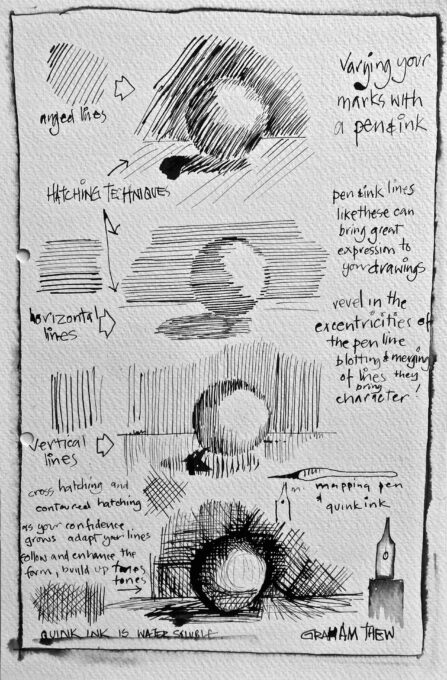
Hatching Techniques & Which Pen to Use?
I have been preparing some additional Information sheets for forthcoming workshops and classes and attach here a couple of the individual sheets I have prepared .
There is a huge variety of pens that an artist can choose these days, it seems to me that the basic question about a pen is whether it is water-soluble or not? Water solubility is the one aspect that can impact the most as to the look of your work. You may want the ink to run or bloom , or you may be adding a line to emphasise aspects or details of your picture, either would demand a very different pen. Thereafter it is just a question of personal preference as to the feel of the pen along with the thickness of line. My sheet shows the impact different pens can have on your work. Of course there are many alternatives to the one I have shown out on the market.

Time and Watercolours
Time is precious, and the time we can find in our busy schedules for our enthusiasm for art is even more precious. Many people say they would love to paint more and on a regular basis but cannot seem to find this thing they call “the time”.
This why watercolour is such an ideal medium to “solve” the problem of limited time.
Watercolours can be painted really quickly and it is surprising just how little time you actually need to create something worthwhile.
Many experienced watercolorists will tell that too much time can often be the enemy and true and fluid watercolour work can often be spoiled by overworking.
There is a saying in watercolour circles…
“The best time to finish a watercolour painting is ten minutes before you actually do.”
Today’s projects are going to show you just how to use your limited time to good effect. The exercises are warming up pictures, practice projects for you to let it “all hang out” , play and go for it.
If you DON’T produce something you are pleased with, well at least you only “wasted” ten-fifteen minutes and a bit of scrap of paper!
However if you DO produce something you are pleased with,
Well you’ve probably:
- loosened up a little,
- learnt something about how pigments mix on the papers,
- seen some subtle blending of colours,
- discovered how different mediums can interact with watercolour to good effect,
- and best of all ignited some ideas about how these 6minute fun ideas can translate into larger works.
This may all prove to be the basis of larger artworks you can pop into exhibitions and maybe even sell to fund the purchase of that special brush you’ve been promising yourself!
NEVER be afraid to experiment, even if the experiment fails you will have learnt some more, expanding your knowledge of just how to conquer the exciting medium that is watercolour.
LEARN about water.
Watercolour is nothing without water.
Watercolour, either out of a tube or from a solid “pan” is mixed with water either on a palette with a brush or on the paper using a wet-into-wet technique where the pigments you drop onto the water on the paper, blend flow and bloom.
The amount of water to pigment is the key to successful watercolour art and something you can really only learn by experience. Practice, practice, practice.
Too little pigment and you produce tinted water and lose the vibrancy of the medium.Too much pigment and the work loses the subtlety that is achieved by the blending and layering of colour.
See how the pigments flow and mix whilst the water is still flowing, wet or damp. Speed in working before the application dries can often make the difference to your work . Have your choice of colours ready , mixed and ready to flow! layer your colours to create monochrome sketches by building up layers of paint thereby increasing the strength of the pigment. Practice, practice, practice.
You can enjoy yourself sitting and watching paint dry!!!
It may sound obvious, but always keep your water clean . Clean water is essential for both vibrant and subtle work.
If the water is muddy it will tint the colours you are laying down. Preferably work with two jars of water, one to remove the residual colour from the brush before you move onto another colour, and the other to dip in as insurance your brush is clean and to soak up the H2O before starting with your next pigment.
And if that isn’t good enough reason remember always that that greenish, greyish sludge in your water jar is unused, unwanted and unloved pigment that you actually paid for!!
↓ Download Time and Watercolours (.pdf)